The SoyBooru relationships map


This was some side project of mine that i forgot about to make thread on after finishing it
More common friends/enemies form a circlejerk of people alike (closer to the center means more common friends/enemies)
Also there is a mode to view common friends/enemies of individual people (people that have more common friends with target are closer to the center where selected person is chosen)
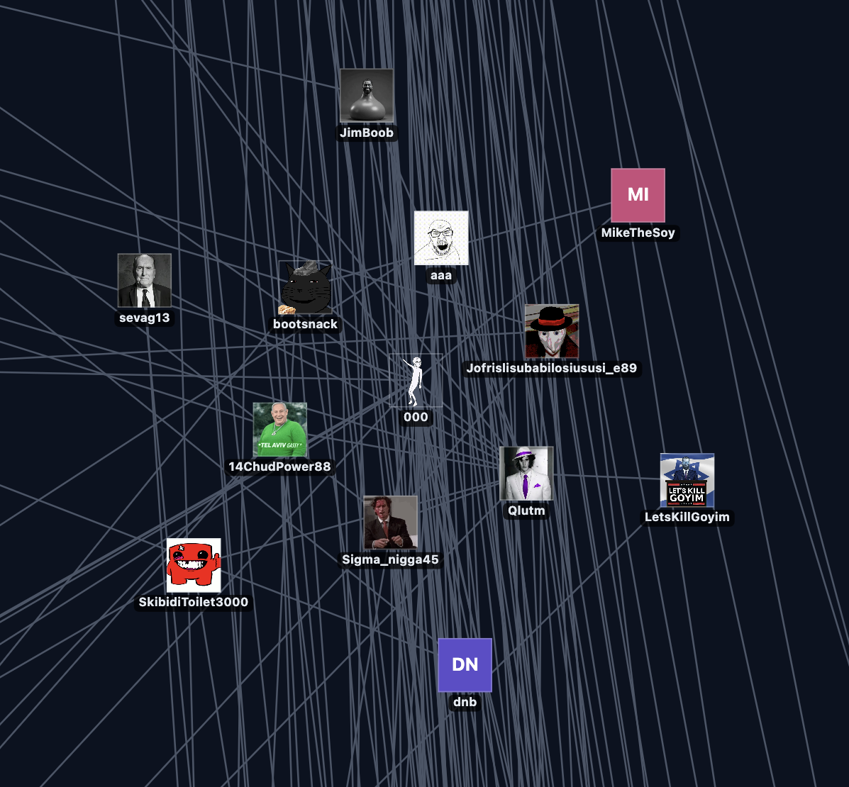
Next there are 4 images of maps and the settings used to generate them
First our map shows common friends
Minimum friends in list: 12
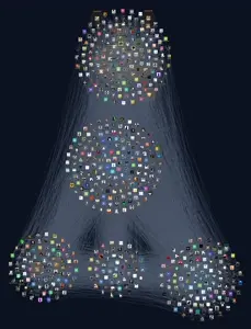
As you all can see there are groups formed like "hunkies" and "mustardcord" and these people are related to each other because they are in similar circles which means that they have a lot of common friends.
Next is the map that shows common enemies
Minimum common enemies: 12
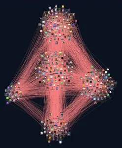
This map is a little harder to understand than common friends one but its basically clumps of people that are in enemy lists of other people that are similar to each other
Heres another look at enemy map but instead it shows only people that have added mustard as their enemy.
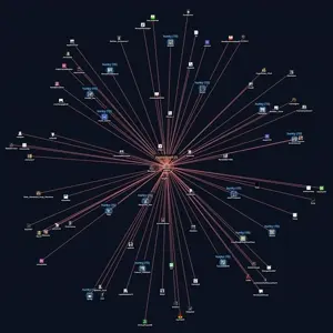
Notice that there is a lot of people from "hunky" group on this map
Now common friends that mustard has:
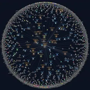
Common friends mode shows picked person in the middle, their friends around them and then friends of those friends
This is basically it. If you want to see what are your enemies/common friends from that date are then just ask in this thread below 👇🏿
It takes relationship data (friends/enemies) and makes a map based off of thatwhat is it?
More common friends/enemies form a circlejerk of people alike (closer to the center means more common friends/enemies)
Also there is a mode to view common friends/enemies of individual people (people that have more common friends with target are closer to the center where selected person is chosen)
Not a surprise but it clearly reveals "hunkcord" and "baitcord" groups being clumped together o so nicely so it is possible to reveal members of those groups without being a member in the first place, also it revealed some tiny groups of people which nobody cares about because they are irrelevantwhat does it reveal? is there anything useful from this at all?
the data is from September 17th which is a month ago so it is quite accurate to todays date but not completely
Next there are 4 images of maps and the settings used to generate them
Click on the image to view it in a new tab in full resolution
First our map shows common friends
Minimum friends in list: 12
As you all can see there are groups formed like "hunkies" and "mustardcord" and these people are related to each other because they are in similar circles which means that they have a lot of common friends.
Next is the map that shows common enemies
Minimum common enemies: 12
Lines in this mode mean that "these two are enemies", bubbles here are clumps of people who are enemies with the same people
This map is a little harder to understand than common friends one but its basically clumps of people that are in enemy lists of other people that are similar to each other
Heres another look at enemy map but instead it shows only people that have added mustard as their enemy.
Notice that there is a lot of people from "hunky" group on this map
Now common friends that mustard has:
Common friends mode shows picked person in the middle, their friends around them and then friends of those friends
This is basically it. If you want to see what are your enemies/common friends from that date are then just ask in this thread below 👇🏿
 19
 11
 10
 1

Interesting

im spared 
It takes 20 mins to scscrap latest relationships data so i wouldnt say soim spared


When was this originally created?

Im not a hunky albeit, I dont care


Does anybody know if im included in this list, im the literally the next nulee

 1

can I see my common friends

cool

@Scuttlefuck how many people are there in total each for the first two graphs


also ive never sent anybody a friend request myself except for paranoid


actually very interesting nice job
Log in to reply to this thread.