My submission for the Halloween logo
NasalCrook
Probably editing or watching MLP
Idk if the competition is closed (cuz the thread got locked) but all of the other submissions werent that good so i might as well post mine
(also maybe change the front page to say “Spookbooru” or “Scarebooru” but thats just an idea)
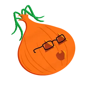
(also maybe change the front page to say “Spookbooru” or “Scarebooru” but thats just an idea)
NasalCrook
Probably editing or watching MLP
@custard
NasalCrook
Probably editing or watching MLP
Ok
NasalCrook
Probably editing or watching MLP
do you really just spam soytan and say ok all the timeOk
What do you mean spam soytan
boolymir
boolymon?
i don’t like it
NasalCrook
Probably editing or watching MLP
NasalCrook
Probably editing or watching MLP
what dont u like about iti don’t like it
boolymir
boolymon?
and you watch mlp
NasalCrook
Probably editing or watching MLP
OpsecRetard
DIAOHDOIHSAODHIUAIHFOIUSAHDIUFHASIUFGDIUOSGIUFOSAGHFIUOHGFIOHG78RT<SA87F9C7DSGAF78GGDSA7FG87DSAGFDSA
OpsecRetard
DIAOHDOIHSAODHIUAIHFOIUSAHDIUFHASIUFGDIUOSGIUFOSAGHFIUOHGFIOHG78RT<SA87F9C7DSGAF78GGDSA7FG87DSAGFDSA
boolymir
boolymon?
i’d just remove the green shit, make the colors stand out a little more, especially the outline, make the face a little bigger and idk fix the glasses
only my opinion tho
NasalCrook
Probably editing or watching MLP
heres how it would look on the frontpage
NasalCrook
Probably editing or watching MLP
good points tbhi’d just remove the green shit, make the colors stand out a little more, especially the outline, make the face a little bigger and idk fix the glassesShow quoted text
like the colors you mean? i tried to replicate the gradient of the onion on it w some guassian blur
only my opinion tho
if custard says smth about the design but wants something changed then im totally open to it
Marigold
haha yeah, im just a classical jacker posting funny soy memes to help keep that 'arty spirit alive
He got one toof
Log in to reply to this thread.